
My Role
– UX Designer
– UI Designer
Tools
Photoshop, Figma, Google Drive, Google Forms, Contrast Checker
 Responsibilities
Ideation, User Research, Competitive Research, Wireframing, Low and High Fidelity Prototyping in Figma, Iteration

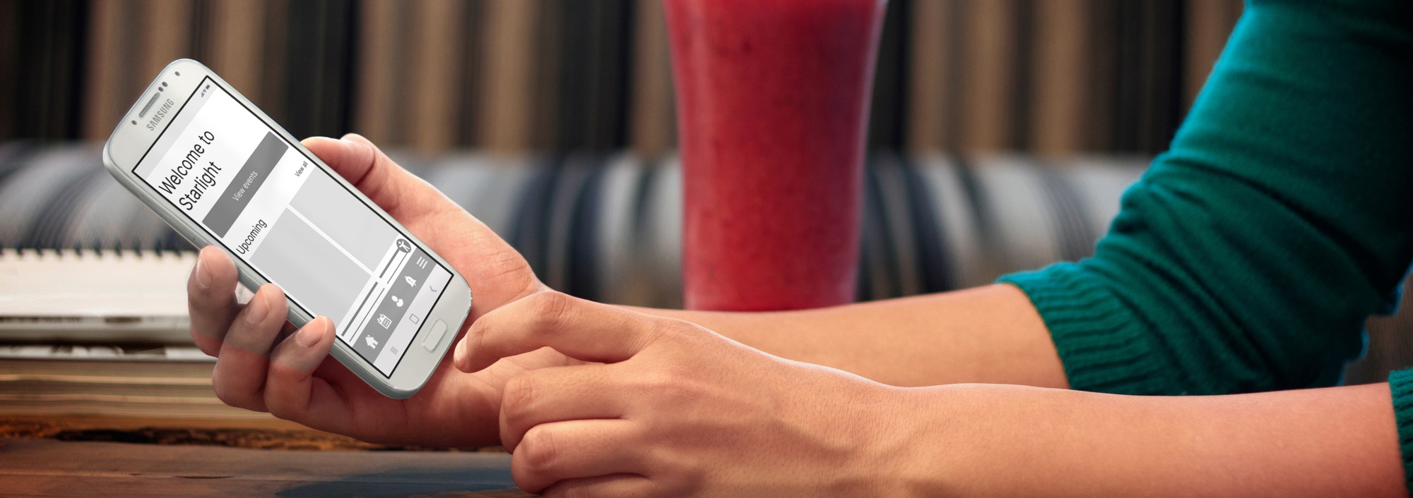
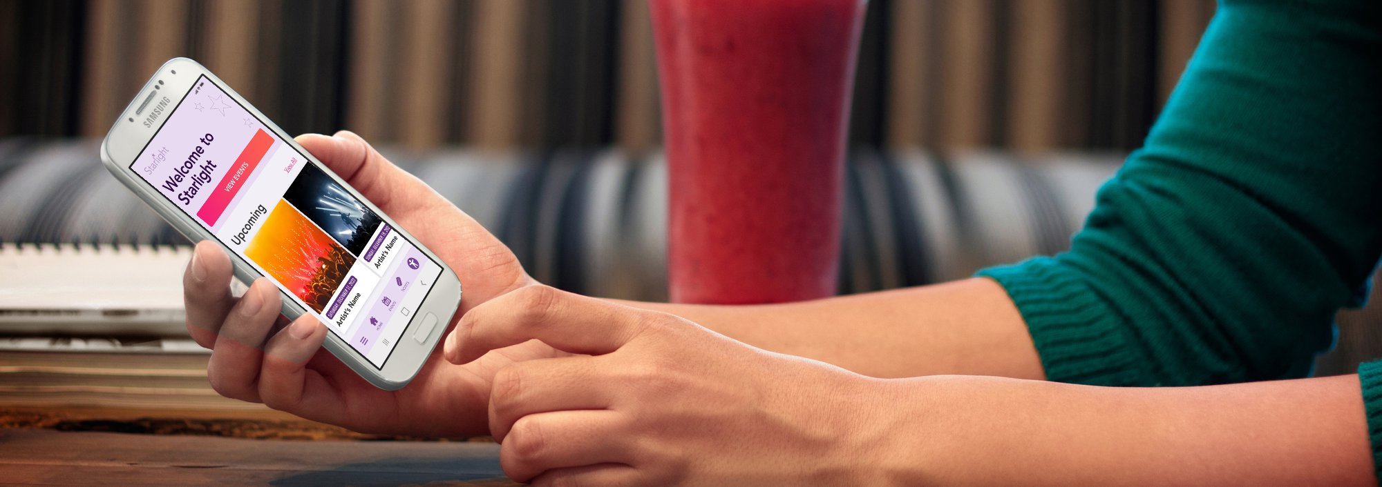
Starlight is an iconic music venue payment app that features a list of upcoming events and a ticket booking system, designed as part of my Google UX Design Professional Certificate course.
Problem:
Music venue needs a new app for users to book tickets. The app must be easy to use, accessible, and offer competitive features.
The Goal:
To provide a smooth experience from selecting a ticket to the payment checkout.

![]()
User Research
During this research I applied first 2 stages of the Stanford d.school design thinking process. I Empathized with users during the interview process, seeked to understand their lifestyle, demographic, goals, challenges and feelings. Personas that emerged from the Define phase were based on relevant user groups living in Miami area. My initial thoughts were that most users would be concerned mostly with payment page itself but found multiple other challenges that provide opportunities for improvement.
Pain Points
1
Affordability
Some users who can’t afford to pay for a ticket at once should be aware of any available discounts and be able to make a purchase and worry about payments later.
2
Parking issues
Finding parking during a crowded event could be difficult. Users should be able to access event parking details and possibly purchase a parking ticket.
3
Reading disabilities
Users with reading and visual disabilities may have a difficulty navigating the app unless the app is properly optimized for their needs. Users with disabilities prefer digital wallet payments.
4
Support availability
Reaching a support staff often takes too long. Users need multiple support options including being able to speak to someone immediately or within a short queue.
User Personas


User Stories
As a driver, I want to plan and book parking in advance so I can easily walk to the venue without wasting time trying to find parking places.
As a budget-conscious college student, I want to have access to discounts, financing, or price drop alerts so that I could afford to purchase a ticket.
As a customer who faces an issue, I want to be able to reach support staff via call or live chat in under 5 minutes so that I can follow my busy schedule.
As a person with dyslexia, I want to customize my visual preferences and use a digital wallet for payment so that I can navigate the app and make a purchase without asking for help.
User Journey Map
Persona:
Sarah Reed
Goal:
Find a way for her to pay for her ticket so she could go to the venue with her friends
Mapping Sarah’s user journey revealed how useful it would be for users to purchase tickets through the Iconic Music Venue app.

Competitive Audit
I researched and identified direct and indirect competitors and noted their general information such as location, price, offering, business size, target audience, and unique value proposition. Then wrote down positive and negative features and rated each category as outstanding/good/okay/needs work. Categories were based on first impressions (desktop/mobile), website interaction (features, accessibility, user flow, navigation), visual design (brand identity), and content (tone and descriptiveness).
I compiled my findings into a competitive audit report and described the competitive audit goals, key competitors, type and quality of competitors’ products, how competitors position themselves in the market, how competitors talk about themselves, competitors’ strengths/weaknesses/gaps, and identified opportunities in the market.


Paper Wireframes
Combining user goal and my observation of top competitors’ apps I drew 6 wireframes of homepage ideas. They include an intro page which could serve as a quick heads up about useful information. In our case the financing option.

Digital Wireframes
Affordability
Based on the budget-conscious college student persona my goal was to introduce and highlight affordability.
Adding financing options benefits both the user and the business. If approved, the user will be able to not only purchase a ticket but could also consider purchasing multiple tickets or an upgraded ticket.
By adding a splash page user will be aware of Buy now, Pay later option before seeing a ticket price


Financing options benefits:
– instant loan approval
– purchase split into payments with no interest
– pay over 6 or 12 months
User Flow

Low-Fidelity Prototype
During the wireframing and prototyping process, I applied the Gestalt Principles, observed user flow from successful competitors, and made design decisions that fit Starlight’s user’s needs.
From the peer reviews, I concluded that the Starlight logo icon placed at the bottom of the menu bar was not perceived as a home button so I swapped the icon for the common house icon.

Usability Study
Round 1 Findings
- Users want be clear about how to complete payment after choosing digital wallet/financing option.
- Users want to choose seating from a map
- Users want to access parking information
- Users want to see the least expensive seating option first
Round 2 Findings
- Users want to easily use the event map
- Users want to easily locate the parking information
The new payment app for an iconic music venue helps people split purchase into multiple payments. I need to find out how users experience the checkout process, including selecting their seats from a map and from the list, applying for financing and completing purchase. I iterated based on problems and user needs identified in the previous study.
During the moderated usability study I asked participants to follow tasks and at the end to complete the system usability scale.
Mockups
Ticket Selection
Early designs allowed ticket selection on the event detail page. Usability study revealed that users were looking to book a specific seat based on the stage proximity. To solve that I removed booking option from the event detail page and created a new page dedicated to seat selection where I added an interactive map with seating sections. When a user selects a seating section the list of seats/tickets gets updated. Users also wanted a way to see most affordable tickets first and for that reason I added a sorting dropdown.
Users found the accessibility icon obstructing page content. In the new design the icon has been moved to the footer menu bar.

Parking Information
In the first usability study I learned that users were looking for parking information at the checkout. In the second usability study I asked users to locate parking information at the checkout page and learned that some users ignored the information icon. I solved this issue by placing a text that said “parking information” next to the icon and changed color to pink to stand out more.

High-Fidelity Prototype

Accessibility Consideration
I’m using a popular accessibility widget. It’s easy to use and offers a wide variety of features including content, color, and orientation adjustments and adjustments based on a medical condition.

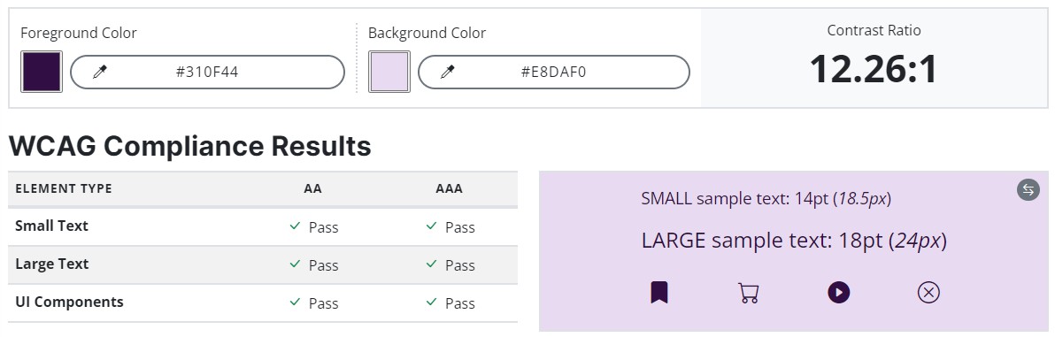
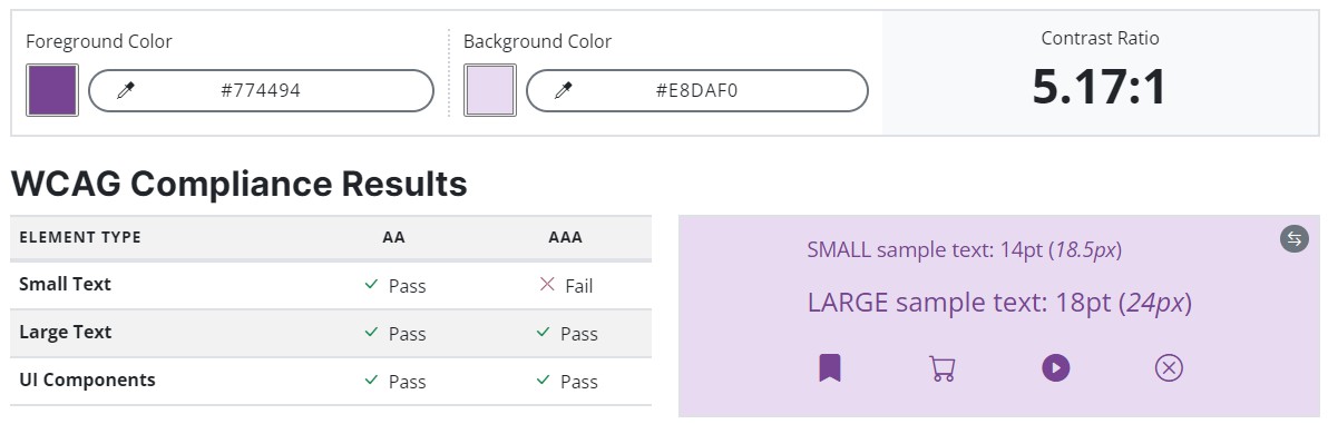
- Optimal size and spacing between navigation icons and button size to accommodate users with unstable hand and help users navigate easier
- Left aligned text, header size based on hierarchy, and sans serif font in contrast color to match accessibility standard for text
- Images include alt tags
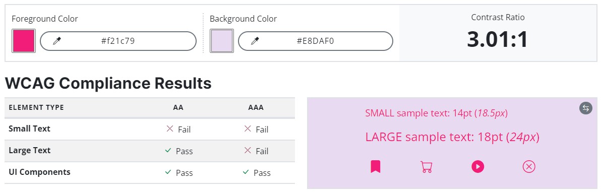
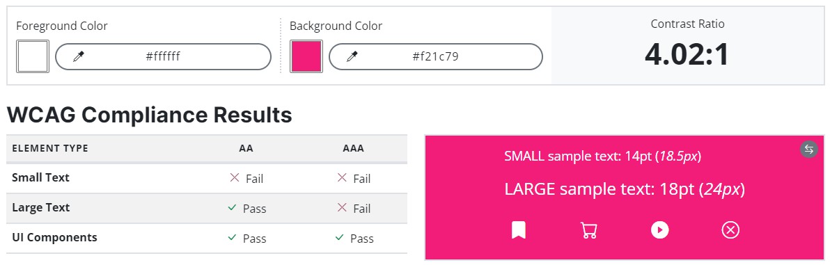
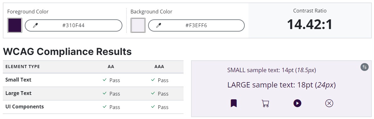
- Contrast check https://accessibleweb.com/color-contrast-checker/
- Using Accessible Web Helper Chrome extension
Takeaways
Impact
The app makes users feel like they could use it on a regular basis to book event tickets and all would recommend the app to their friends.
What I learned
I learned that asking the right questions and the way I ask questions makes a difference in feedback quality and reduces bias.
Next Steps
1
New usability study to confirm that all issues from the previous study have been resolved.
2
Collect data about social sharing and reviews and iterate based on results.
3
Once developed in testing environment ensure the code is up to date with accessibility standards.

